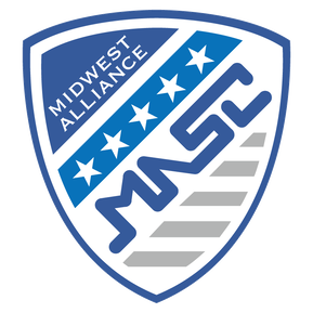
The MASC shield maintains the league’s original blue fonts, but it now takes on a shield shape. Designed by students at the Fort Hayes Metropolitan Education Center in Columbus, Ohio and voted in by league membership at the 2016 Presidents' Meeting, the new logo has many meanings. Our shield truly reflects who we are as a league, from geography to physical features in the Midwest.
The league's name, “Midwest Alliance,” wraps around the shield’s upper left side and inside the heart of the logo are five key elements:
(1) the five stars represent the five states that make up NIRSA Region III
(2) the acronym "MASC" identifies the full name of Midwest Alliance Soccer Conference
(3) nine horizontal bars highlight the nine charter clubs that formed the league in the league's inaugural season
(4) the color gray and the gray bars are a symbol of independence and stability
(5) the different shades of blue represent water, which is such an important part of the Midwest. The Great Lakes, and the Ohio and the Mississippi Rivers help to establish the boundaries of our region.
The MASC's sister conference, the W-MASC; has a shield that is a mirror image of the men's league.
